Enhanced Water Temple Experience in Ocarina of Time Remake
ByJane McGonigal
The recent launch of The Legend of Zelda: Ocarina of Time on the Switch 2 has ignited a wave of nostalgia for dedicated Nintendo enthusiasts. While the remake faithfully recreates many cherished moments, it also revisits one of the series' most infamous challenges: the Water Temple. However, unlike its predecessor, this updated version introduces thoughtful enhancements that significantly alleviate the frustration associated with navigating its complex water-level mechanics and managing crucial in-game items, making it a more accessible and enjoyable experience for all players.
Water Temple Revamped: Clearer Navigation and Visual Cues
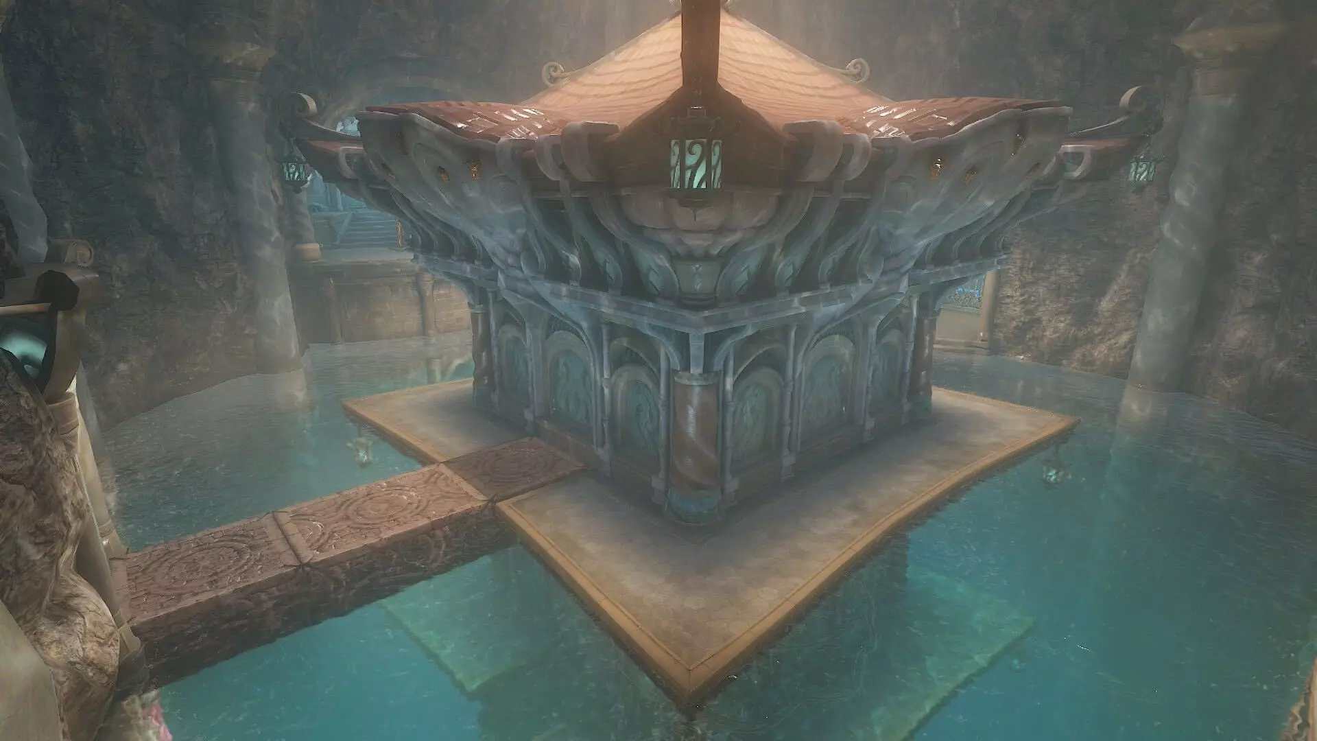
The notoriously difficult Water Temple in Ocarina of Time has received significant design improvements in its Switch 2 remake, addressing decades of player frustration. Originally a convoluted four-story structure where players had to mentally map water level changes and control points, the remake now provides clearer guidance. Inspired by the Ocarina of Time 3D redesign, doors leading to water controls are explicitly marked with symbols indicating the water level adjustments they trigger, eliminating the need for players to memorize complex routes or blindly experiment with switches. This direct and intuitive signposting streamlines progression and reduces the trial-and-error often associated with the dungeon's puzzles.
Adding to the navigational clarity, the remake introduces a clever color-coding system within the Water Temple. Different colored pipes now visually guide players to the respective control rooms for water level manipulation. For instance, following blue pipes indicates the path to lower the water, often prompting players to float to the surface to find clearly marked pedestals for using their ocarina. These visual breadcrumbs are a crucial addition, allowing players to consistently understand their current objective and the path forward without consulting external guides or relying on memory. This strategic visual overhaul ensures that players can maintain immersion and focus on solving puzzles rather than getting lost in the dungeon's intricate layout, significantly enhancing the overall gameplay flow.
Streamlined Item Management for Enhanced Gameplay
Beyond navigational improvements, the Ocarina of Time remake significantly enhances the Water Temple experience by optimizing item management, a long-standing point of contention for players of the original. The original game's limited three item slots forced constant pausing and menu navigation to swap essential tools like the ocarina, Iron Boots, and Hookshot. This frequent interruption often broke immersion and added to the dungeon's perceived difficulty, especially during critical puzzle-solving sequences where quick access to specific items was crucial. The remake addresses this by re-evaluating core control decisions, making the overall experience much smoother and more fluid.
In a wise design choice, the Switch 2 remake permanently maps the ocarina to the D-pad, ensuring instant access without occupying a valuable item slot. Similarly, the Iron Boots now have a quick-swap button on the D-pad, freeing up another slot that was previously monopolized by this frequently used item. With these necessities conveniently accessible, players can dedicate the ZR item slot to the Hookshot and easily swap to other secondary items using a quick menu accessed via the R button. This thoughtful redesign eliminates the tedious pause-menu juggling, allowing players to concentrate on exploration and puzzle-solving within the Water Temple without interruption. The result is a more immersive and less frustrating gameplay loop, enabling players to navigate the dungeon with unprecedented fluidity and enjoy the challenge without the unnecessary friction of clunky controls.
About the author
Jane McGonigal
Game designer and author who writes about using games to improve real life and solve problems.